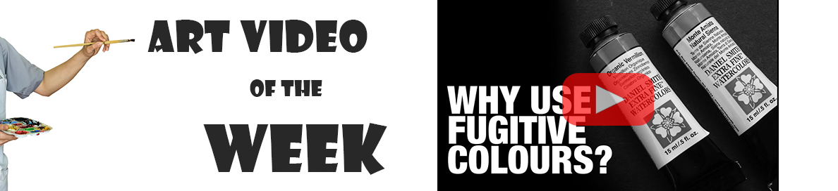
I missed last week while I was on vacation, in Kentucky, to see the total solar eclipse. However, I'm back, and this week I wanted to touch on the subject of lightfastness and fugitive colours as I have been, recently, building a watercolour swatchbook for all of the brands I have that shows name, pigment (when available), lightfastness, and opacity.
For a good rundown on the concept, Teoh of Parka Blogs describes the various rating systems in use by paint manufacturers and talks about why fugitive colours might still be in your pallet:
One of the things I really noticed is that reds are most likely to be the most fugitive of the colours you'll own, especially something like Alizarin Crimson which is very common to many pallets. So, as Teoh notes, if you're practicing or sketching in a book, then there isn't a lot of issue with fugitive colours, but otherwise what can you do?
Well, one really good option is archival varnish as it is designed to provide a UV barrier to protect the paint from wear and fade. There are a couple of things to be aware of:
- It will alter the appearance of the colour
- It requires several coats (as many as 6)
- Technique matters
Done right, though, and you can turn a very fugitive colour into a lightfast one. There is also Tru-Vue Optium Museum Acrylic glass if you don't want to spray your support, but this is also expensive and likely not realistic for the average painter, especially a hobbyist.
For more reading, head on over to Just Paint for GOLDEN Archival MSA Varnish Over Transparent Watercolor on Paper to see some interesting test results around using varnish, Tru-Vue, plain glass, and nothing at all.